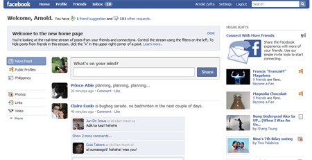
Update: I just checked out my Facebook profile and it’s now showing the new home page. My initial reaction is that the Highlights on the left side and the live news feed on the main column seem a bit redundant. But aesthetics wise, the new home page looks cleaner than the old one. And I would have to agree with Jason, the new home looks more like Twitter now. See screenshot after the jump.
So, has the new “streamlined” Facebook home page activated on your profile already? Mine has not yet been shifted to the new homepage. But some users are already seeing it on their Facebook profiles. The new Facebook home page which was announced last week would have the following major changes:
- Improved News Feed, or the stream of content that’s most relevant to you. This stream lets you know what’s happening right now in your world by showing you everything your friends and other connections, such as celebrities, athletes and politicians, are sharing. The stream also makes it simple for you to comment on content and participate in conversations in real-time.
- improved Publisher now siting on the top of the home page making it easy to add your own status, links, photos, thoughts and more into the stream. The Publisher has been updated across the site, including on your profile allowing you to create content on Facebook, you will know it’s going into the stream.
- controlling the streams is easier doen with dedicated filters based on user location, connection and existing Friend Lists. You can also filter the stream to show you posts from specific applications.
- know what happening over a longer period of time through Facebook Highlights. Highlights will feature photos, notes and other content you probably don’t want to miss: events lots of your friends are attending, links many people have commented on, public profiles your friends connect to and so on. Birthday notifications and pokes will be in this section, as well.
Jason of TC is among those who has the new home page on his Facebook profile. And his initial impressions about the new page are:
- It feels a lot more like Twitter. The whole page focuses around conversations, which isn’t a bad thing at all (I’m noticing fewer items around photos and events)
- Items may be posted in real time, but it doesn’t seem like the page updates as the items come in (I’m having to refresh to see new content)
- The Highlights section doesn’t exactly do a great job at highlighting news stories. With only a narrow column to work with the stories don’t stand out. And with so little real-estate, sponsored items (which are basically just ads) are more irritating.
- The ability to filter the News Feed by Friend Lists is great (I can’t believe we’ve gone this long without it) You actually could filter by Friend Lists in the old version, though the feature was less visible. You can also ‘x’ out friends you never want to see appear in your News Feed again.


