You may have noticed the new look of the news feed and personal timelines that Facebook rolled out over the past few weeks. It’s begun debuting got business pages as well, and will eventually be mandatory. Here’s the scoop to help you prepare for the transition and plan for the future.
Some have been given the option to implement the new timeline before the adjustment rolls out for all business pages. If you get the option to begin editing your page for the new timeline prior it to going live, I highly recommend doing so to ensure your page is where it needs to be.
The new Facebook page timeline design has been updated to make posts look consistent to how they would appear in the news feed. In looking at the presentation of the posts themselves, the new format eliminates the back-and-forth component and streamlines them into a single column on the right-hand side. On the left-hand side, everything else is now housed. It used to be that reviews, recent posts by others, and other pages the page liked resided on the top right of the timeline.
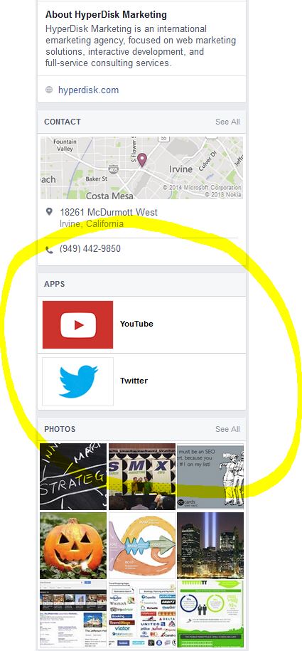
Along with all these features, photos, contact information, and apps are now listed on the left as well. Here is a bird’s eye view:
The top portion is quite different. Currently, “photos,” “likes,” “events,” and customized apps appear as tabs just below the Facebook cover photo.
With the new timeline, these tabs are no longer present in this location. The default aspects now appear simply as words, while actual apps have evaporated from their prominent placement and are now housed in their own box along the left-hand column once you scroll down.
The back-end for administrators is also quite different and it’s worth taking some time to explore the new interface and functionality.
First, the large administrative dashboard that was at the top has been condensed:
“Page” takes you literally back to your page, while “activity” now refers to your notifications and “settings” takes you to all your back-end goodies like page info, admin roles, and activity log. The “insights” page is still identical to its predecessor.
To the right of the cover photo is what Facebook deems the most important data, like how many ads you have running, your number of page likes, post reach, and notifications:
Perhaps the largest and most controversial aspect of this change is the relocating of app tabs. Rather than being prominently placed below the cover photo to immediately catch users’ attentions, apps are now located in a box on the left side, blending in with everything else.
Many business relied on these for contests, linking to their various other social media pages, videos, custom categories (for example, many hotels and restaurants utilize custom tabs to allow users to make reservations directly from Facebook; animal shelters use them to show available animals, etc.), and more.
Although Facebook revised their former rule that all contest must be housed in a Facebook app, many businesses still host contests through apps since it allows the most customization and control. It will likely be imperative for businesses to explicitly advise entrants to locate any apps in their new location while users get accustomed to the transition.
“A work around is to share the links to your apps every now and again, or, better yet, post pictures which describe what your app does (‘Follow us on Twitter,’ ‘Watch our YouTube videos,” etc.) and put a link in the picture description,” notes Louis Tanguay of Circle Marketing. “To keep the message fresh, use different pictures and graphics so you’re not posting the same looking thing all the time, and you’re keeping your posts new and fresh looking.”
What do you think of the new timeline layout? After we adjust to the change (which is always the hardest part), do you think the new streamlined look will be embraced?
Screenshots taken April 2014


