

I look at quite a few websites. In fact, I sometimes describe myself as a “professional web surfer,” because it seems like that is how I spend most of my time.
When I’m browsing, I see a lot of great stuff and a lot of crap. In this article, I share with you five best pop ups out there. Check these out, and see if you’re as amazed as I am.
ConversionXL is no stranger to awesome CTAs and in-your-face marketing (editor note: ConversionXL Tommy Walker is a contributor to SEJ, but didn’t ask SEJ or Neil to include the site in this post). These guys know a thing or two about conversion optimization, so it’s no surprise that they’ve got a kickass pop up.
Check it:
Here’s why this pop up is awesome.
It Uses the Appeal of a Numbered List
Statistics and studies show that numbered lists are incredibly appealing. It’s a headline technique that is sure to work every time. This pop up starts off with big time numbered list appeal. The number “5” is the largest text on the button.
It has a Two-Color Contrast Strategy
Every call to action needs to have some color, or at least something to make it stand out. The wizardry of this pop up is its limited color. A black and grayscale design means that the red button and copy will stand out. Notice how “persuasive web design,” “get the answer,” and the “YES” button are all backed by the power of red.
It Uses Compelling Words
The individual words in a CTA have explosive power—power to either stall a conversion or create a gush of conversions. This pop up has several extraordinarily powerful words. 1) Principles, 2) Persuasive, 3) Answer, 4) Reveal. Each of these words have a feeling of exclusivity, anticipation, and power. Each of these are conversion ready words. There are only 33 words on the whole button, so each word counts.
You Must Choose “Yes” or “No.”
In a study from Cornell University the “words of natural human language possess a universal positivity bias.” The word “yes” is 100% positive. By contrast, the word “no” is inherently negative. From a psychological, developmental, and emotional standpoint, a person is far more likely to gravitate toward “yes” language than “no” language. By presenting two options—a “yes” or a “no,” this button gives the user an obvious choice
There is No Form to Fill Out
Without a form, a user is more likely to convert. There is no friction, no barriers, and no limitations. All the user has to do is click. It’s a low-risk conversion action. All you have to do is admit that you want to know how to design persuasive pages.
It Gives You a Simple Next Step Page
When you click on “Yes,” the pop up presents the following:
With the words “final step,” this pop up informs users that the process is nearly complete. The word “FREE” is a huge conversion trigger, making this final step of the process very easy for any reluctant user. What stands out to me most is that this second step of the pop up has as much persuasive power as the first one. It uses a variety of design and psychological techniques to keep persuasion at full tilt.
SocialTriggers is an online marketing strategy site founded by Derek Halpern. It’s got some great resources, some interesting articles, and this killer pop up.
Actually, it has two pop ups, depending on when or what you visit:
I’ll describe the amazing features of both of these because of their similarity.
They Use the Power of “Free”
According to Gregory Ciotti of Help Scout, “free” is one of the most powerful words in the English language. Each of these buttons capitalize on “free” language in a big way. The phrase “free book” and “for free” are huge. Plus, they are positioned centrally in the pop up, meaning they are the first thing you see.
The Words “Learn” and “Teach” will Persuade the Right Target Audience
Depending on who you are, “learn” and “teach” are very persuasive words. Social Triggers is targeting an audience who wants to learn. Thus, this pop up holds powerful appeal for this select group.
They Ask a Question
Questions are compelling features to have in a pop-up. Rather than make a declarative statement that can either be ignored or discounted, a question demands a response. Obviously, you can ignore a question, too. However, because of its interrogative nature, a question begs an answer. When that answer is obvious, the user has already reached a conclusion in his or her mind. Here, of course, the conclusion is “Yes, I want access or a free book.”
With that mental “Yes,” the user has edged himself closer to a conversion.
Kissmetrics, a software company that I co-founded, provides data on your website’s users, not just raw metric dump. This pop up invites users to understand their own marketing performance in the light of real case studies.
There are some features of this pop up that make it really effective.
It’s Really Simple
Clean, smooth, intuitive, and obvious—that’s what characterizes this pop up. There is plenty of negative space. With a clear eye path and logical flow, the user can’t help but convert. The visual flow travels down the left side of the pop up. This is the standard directional tracking of English-language readers. It’s known as “left-to-right,” or abbreviated with this symbol: . This pop up follows this ingrained eye path, placing the “Yes” button in the natural click path of the reader’s directional eye tracking. Obvious, but brilliant.
It has a Shock-Value Headline.
The shock-value technique invites clicks and garners attention. It’s a smart move in headline creation, and this headline gets it right. By declaring that “aggregate data is kinda worthless,” this pop up is making a statement that flies in the face of conventional wisdom. Most marketers rely on aggregate data as their bread and butter data. Thus, this shocking statement helps to make users interested in what comes next — the attraction of a free case study.
Marketo is a marketing automation software. This company positions itself as a player in marketing best practices, and this pop up nails it.
This pop up uses many of the features I’ve discussed above and adds in some more.
It Positions Design Elements and Conversion Elements Strategically
Notice how the “get free” headline leads off in a big way. By placing images at the bottom of the pop up, the user’s sight is drawn downward, allowing her to focus on the entry form and submission button. This strategic use of attention distribution means higher conversions.
It Provides a Trust Signal
The presence of trust signals on a website is critical to conversion success. Marketo gets this. With the little phrase “We respect your privacy,” they are offering a trust signal that may help skeptical users to convert.
It Uses a Single Entry Form
Too many fields on an entry form makes people not want to fill it out. If you remove every field but one, you’ll probably improve conversion rates (for most types of landing pages). This is what Marketo did. This pop up asks for one piece of data — the email address.
5. AudienceBloom
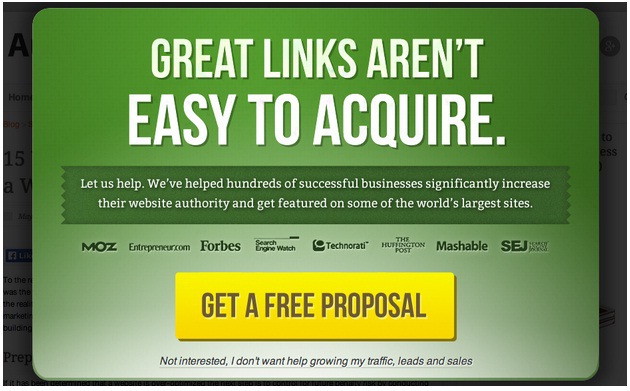
AudienceBloom provides link building services. Their services fill a need, and that’s exactly what their pop up targets.
It Addresses Pain
The “secret of neuromarketing” according to a New York Times article on the subject, is to “go for the pain.” What this means is that users needs to feel some pain in order to be compelled to buy. The idea is to make users think about their frustrations and challenges, and then provide a product or service that helps them. This pop up does exactly that. By asserting that “Great links aren’t easy to acquire,” any SEO can relate.They will think about how hard it is to get awesome backlinks.
It has Trust Signals
On his blog, conversion expert Arun Sivashankaran writes, “trust signals are more important than ever, not only to win your customers but to set you apart from fly-by-night companies in your space. This reality is particularly germane to online businesses.” These trust signals are exactly what AudienceBloom is using by featuring a row of recognized logos underneath their value proposition — organizations like Moz, Entrepreneur, Forbes, etc.
This a technique that I use on my website’s testimonials page. Using such signals on a pop up isn’t conventional, but in this case, it’s powerful.
That Button is Impossible to Miss
I love their CTA button—big, yellow, and completely unmissable. Yellow is a great conversion color. In this case, it’s perfect against the green backdrop.
It’s Impossible to Close the Pop Up Without Going to the Bottom of the Page
This pop up uses a technique that none of the other pop ups do. The only way to close the pop up is by clicking on the refusal line—”Not interested.” This does two things; 1) makes it harder to say “no,” and 2) makes the user’s eye path travel right to the button.
If the user is looking at the “Not interested” line, they can’t help but see the big, beautiful button right above it. Those extra few milliseconds of looking at the CTA may help improve the likelihood of a conversion.
Conclusion: Why are These Pop Ups so Effective?
In summary, I want to draw out several takeaways. What are some features that all of these pop ups have in common? Why are they so brilliantly effective?
1. They are Pop Ups
Let me start with something obvious. Each of these are pop ups. That feature is part of their overall value.
In 2004, Jakob Nielsen vilified pop ups, declaring them, “the most hated advertising technique”. He described it as a “sin,” a source of “frustration,” “intrusive,” “irrelevant,” “unsavory,” “annoy[ing],” and “negative.” His position was that “respectable sites should avoid them at all costs.”
Wow.
Thankfully, that was ten years ago. A lot has changed. The entire process and method of content marketing has evolved, meaning that the annoying pop ups of Nielsen’s diatribe are virtually extinct. The pop ups you studied above are symbolic of the strategy and marketing savvy of today’s digital entrepreneurs.
Are they still annoying? Maybe.
But are they effective? Unquestionably yes.
Pop ups like these eliminate all the background noise competing for the user’s attention. The user must focus some degree of attention on the pop up, even if their intent is to click away.
2. They Each Speak Directly to the Target Audience
Each pop up featured here creates an offer that is irresistible to their target website visitor. To enhance this appeal, most of the pop ups appear on the blog of the website. These readers, presumably, have arrived at the website to read relevant content. The pop up’s message is completely in line with what the user came to read.
3. They have One or Two Choices Each
Limiting choices is one of the best ways to help users make a choice. The fewer the choices, the more likely someone is to choose one or the other. With the exception of Marketo, these popups all provide the user with two choices: 1) The “Yes” or smart choice, or 2) the “No” or “I’m stupid” choice.
By clicking on the “No” choice the user is forced to feel the pain or discomfort of their choice.
4. They are Huge
The images above didn’t show it, but these pop ups are large. Most of them fill 80-90% of the screen on a standard notebook computer display. Because they dominate so much of the screen real estate, they also dominate the user’s attention. Bigger is better in some aspects of web design, and pop ups are a clear situation where size matters.
So, Should You Use Pop Ups?
Here’s what the professionals have to say about pop ups:
- Unbounce: “Pop ups are probably one of the best ways to increase your email subscribers. And fast.”
- Evergage: “A web page with a pop-up typically sees more conversions than the same page without a pop up.”
- SocialTriggers: “Should I use those annoying pop ups? The answer is YES!”
Pop ups work, as long as you’re doing it right. And if you’re looking for examples to follow, you can’t go wrong with the ones featured here.
What are some features of effective pop ups that you’ve seen?
Image Credit: All screenshots taken August 2014


